Brief: Create a fun and experimental poster design for my favorite MLB player Shohei Ohtani. Create a piece that's eye-catching and out of the ordinary for the average sports graphic.
How did we go from these unrelated elements...

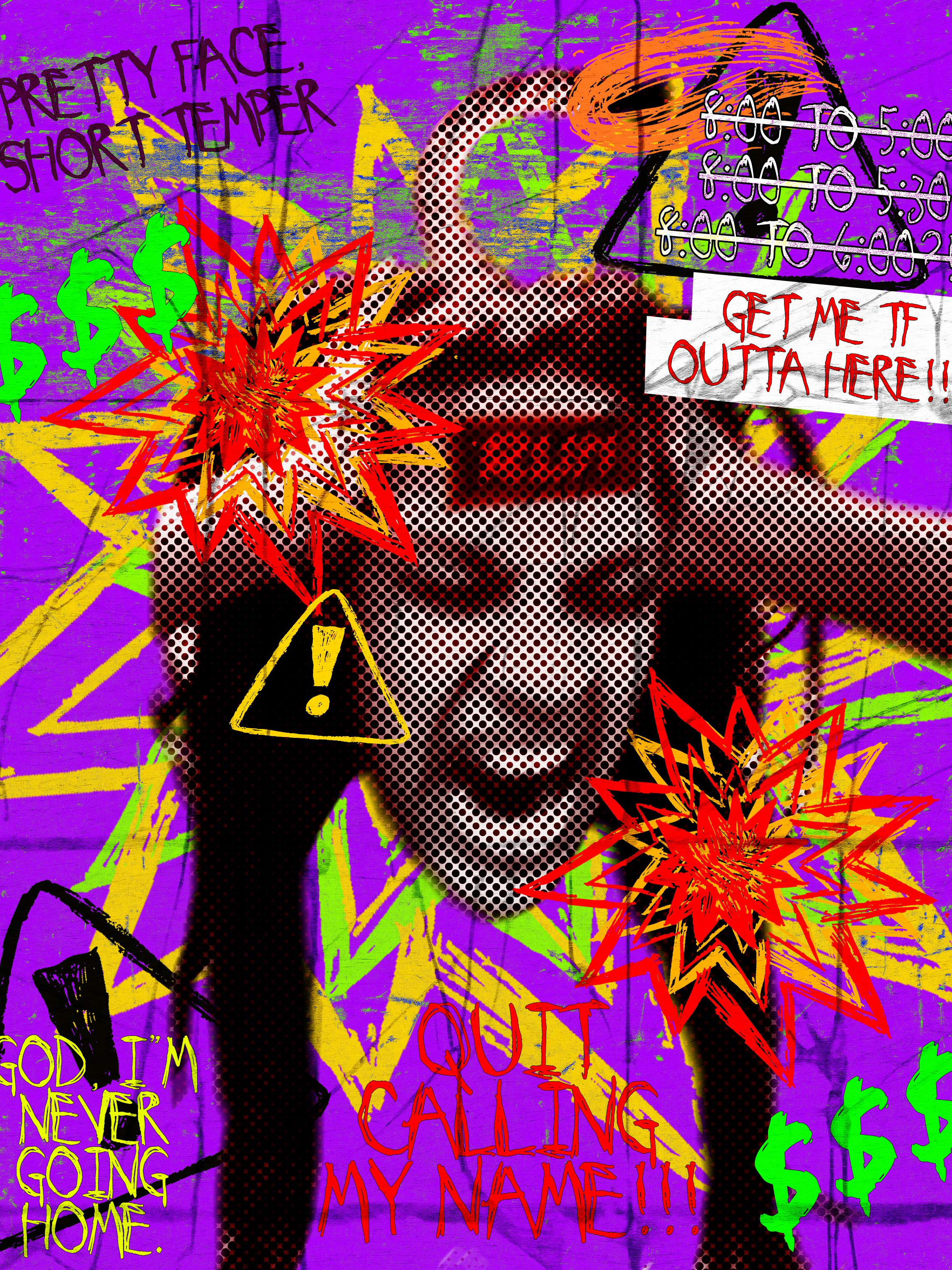
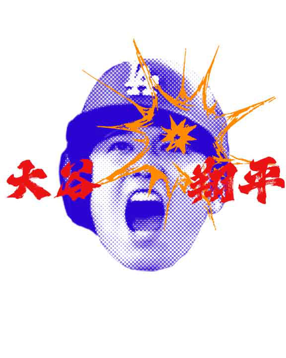
...To this monster of a poster?

It all started from an idea, another poster of my favorite baseball player, Shohei Ohtani. The concept was simple: create a design that captures the electrifying energy and excitement of watching him play. So I set out to find my inspiration...
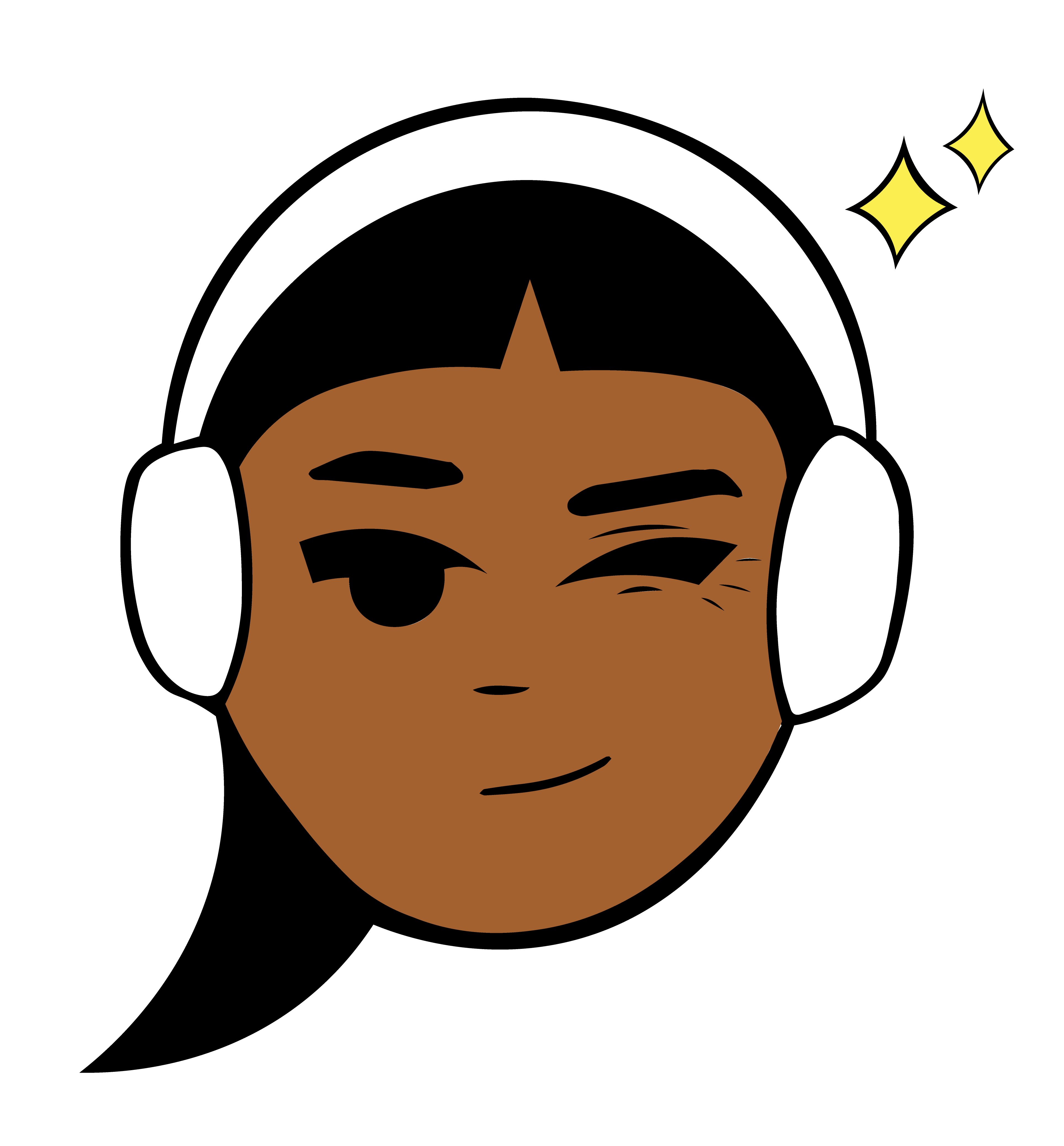
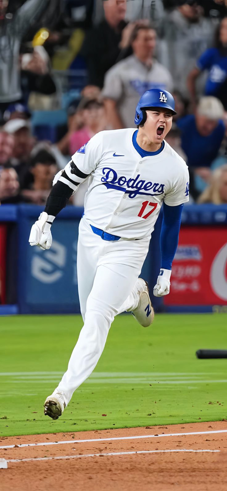
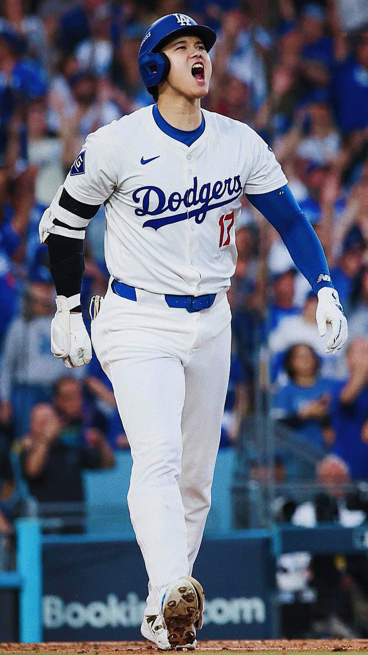
And my images...
Initially, I planned to use all three headshots in Illustrator, but after multiple failed attempts to achieve a halftone effect I was satisfied with (and a frustrating computer reset), I ditched Illustrator altogether. Instead, I switched to Photoshop, which gave me the results that I was looking for. From there, I focused on a single headshot and began experimenting.
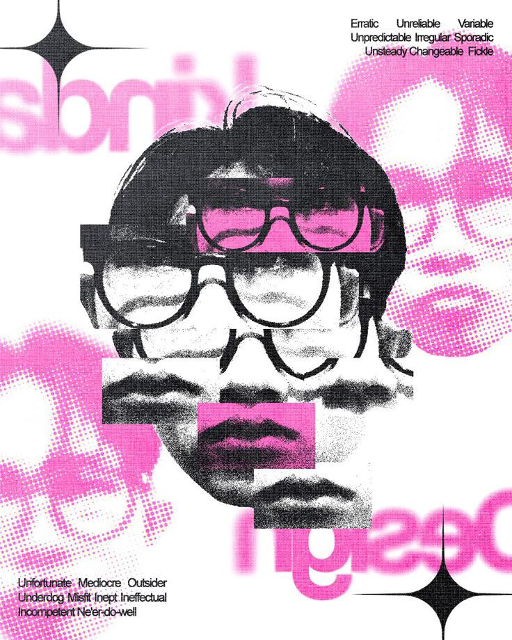
Two early-stage versions of the poster, each featuring a different placement of the orange explosion doodle.
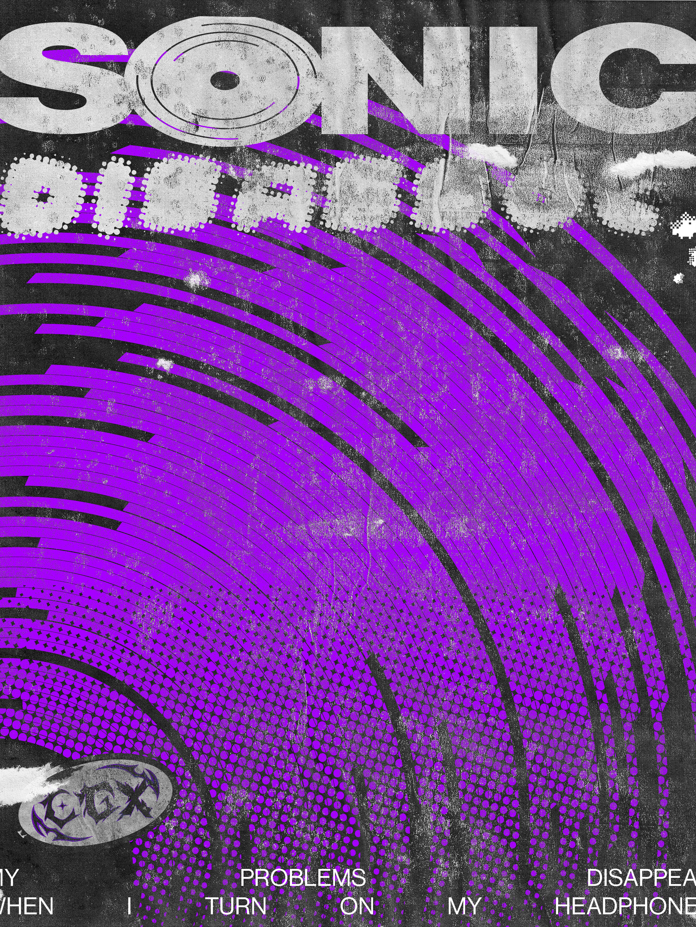
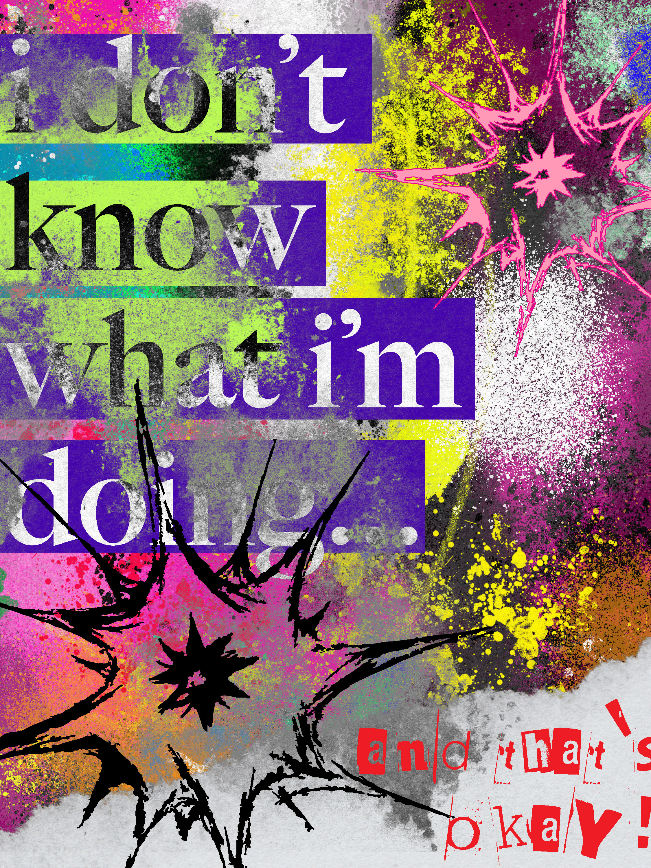
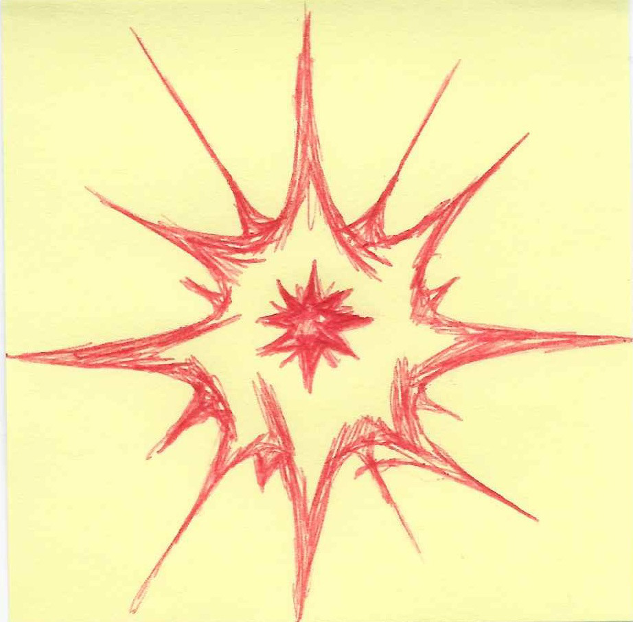
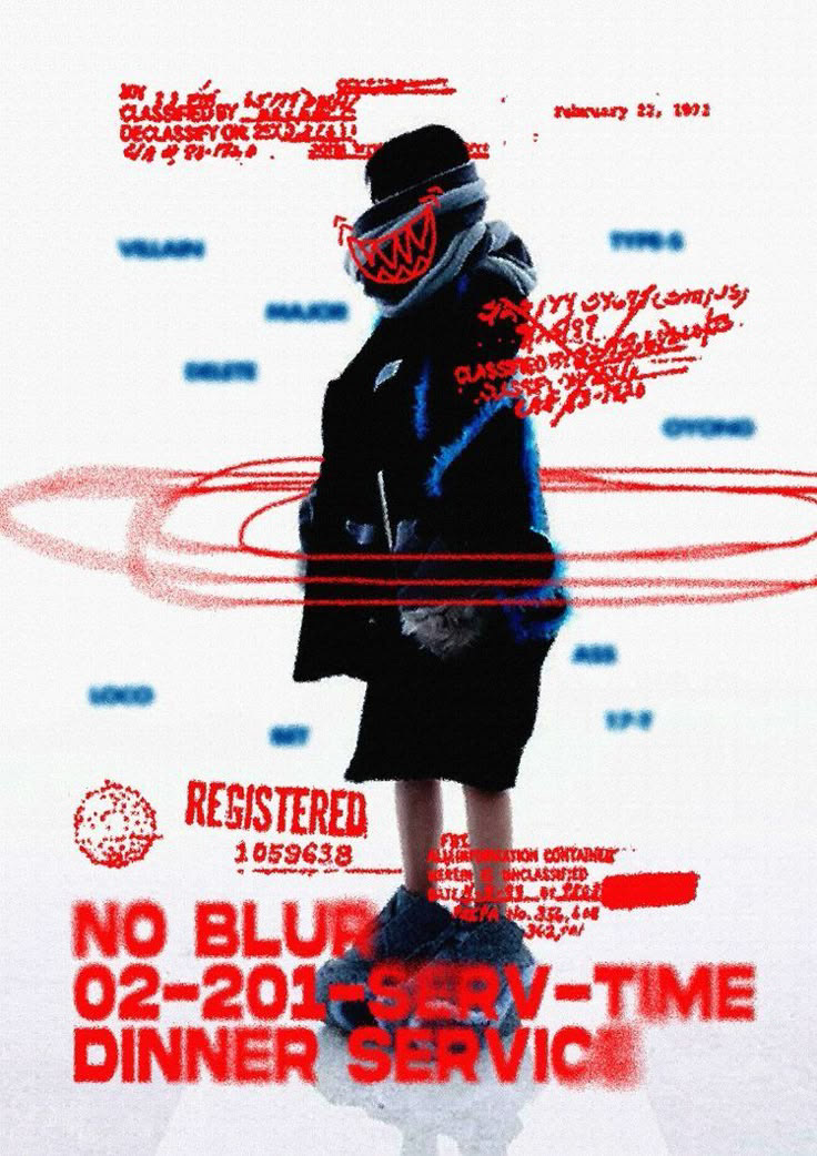
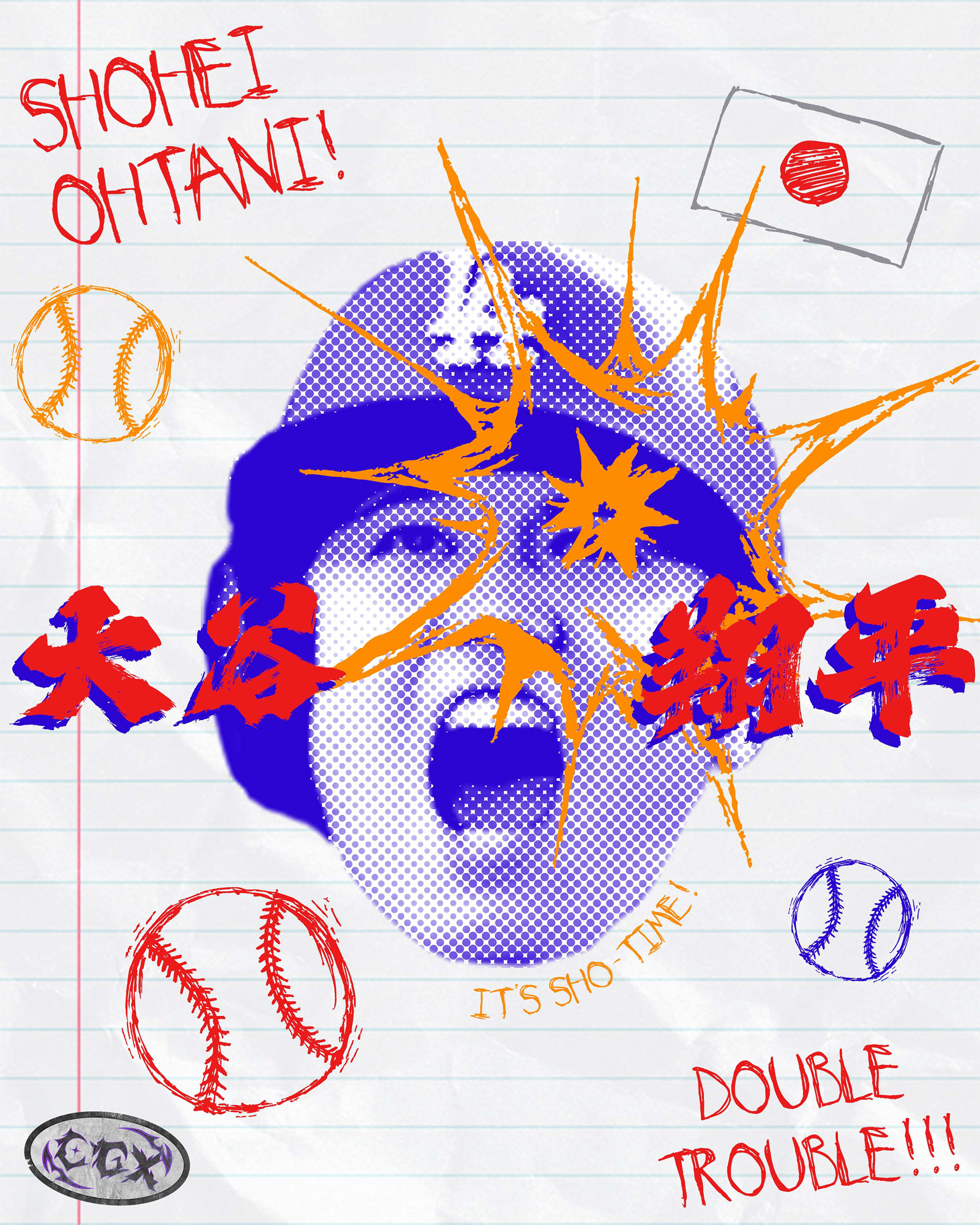
Seeing the halftone effect on Ohtani's face alongside the kanji version of his name (大谷 翔平), I realized the design strongly echoed Japanese aesthetics—particularly the bold energy found in their advertisements and television graphics. This inspired me to incorporate my messy scribbles, adding even more motion and intensity to the poster.

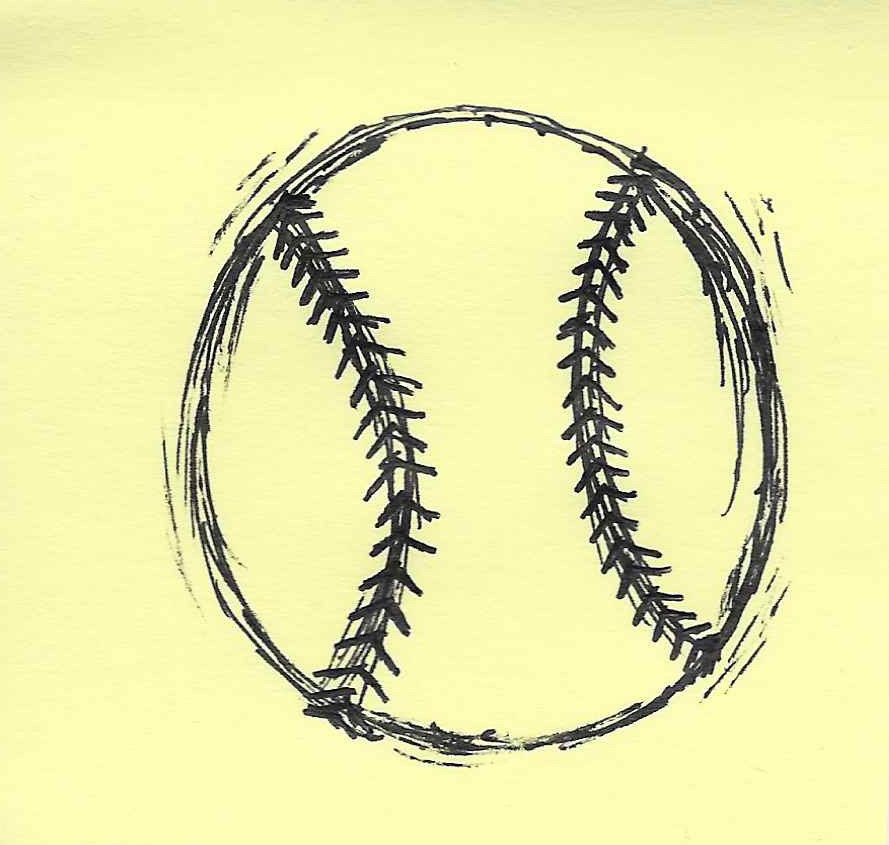
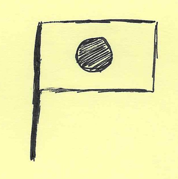
Three sticky note scribbles used in the poster design: red explosion (equivalent to his high power swings), a baseball, and a Japanese flag.
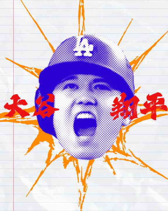
These elements, in addition to my logo sticker and the fonts "My Imaginary Friend" and "HelloFont ID CangQiongTi" (both regular versions), culminated into this "final" design...
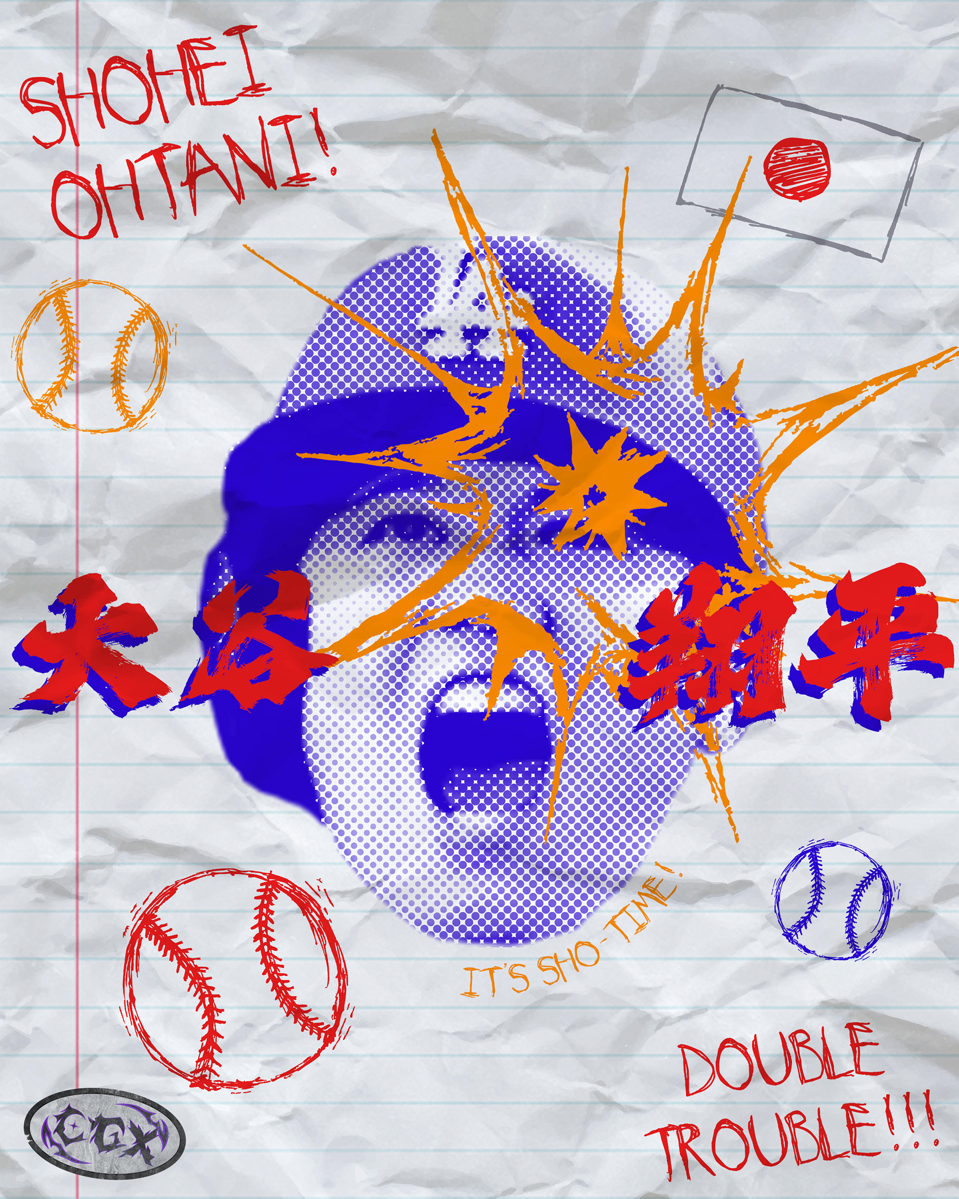
…That is, until I realized the composition felt too clean. To add more depth and character, I overlaid a crumpled paper texture—almost like it had been stuffed in someone’s backpack. Now this felt right! High energy, dynamic, and just a little chaotic—just like Ohtani himself!
Jersey Shirt Design & Full Process video
Beginning as a homage to one of my favorite athletes, this piece somehow became one of my boldest posters to date. Inspired by Shohei Ohtani’s duality as a player, I leaned into layered textures, chaotic type, and high-impact color to mirror that same unstoppable energy.
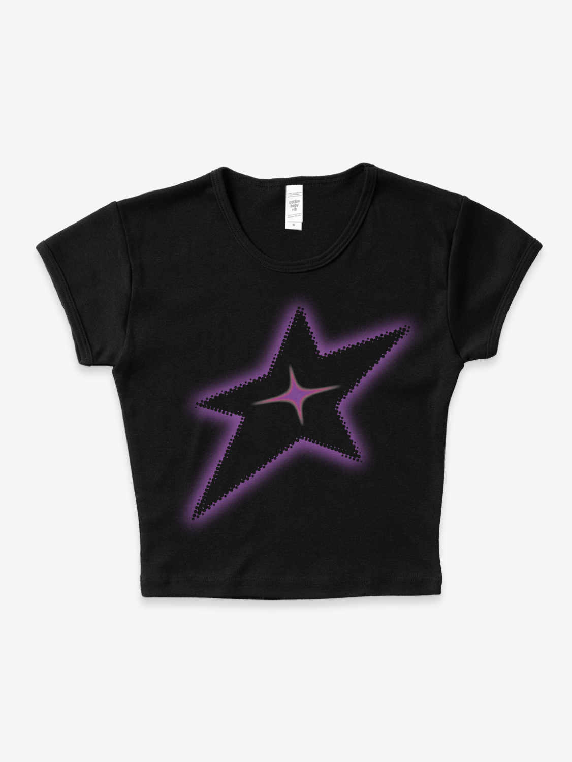
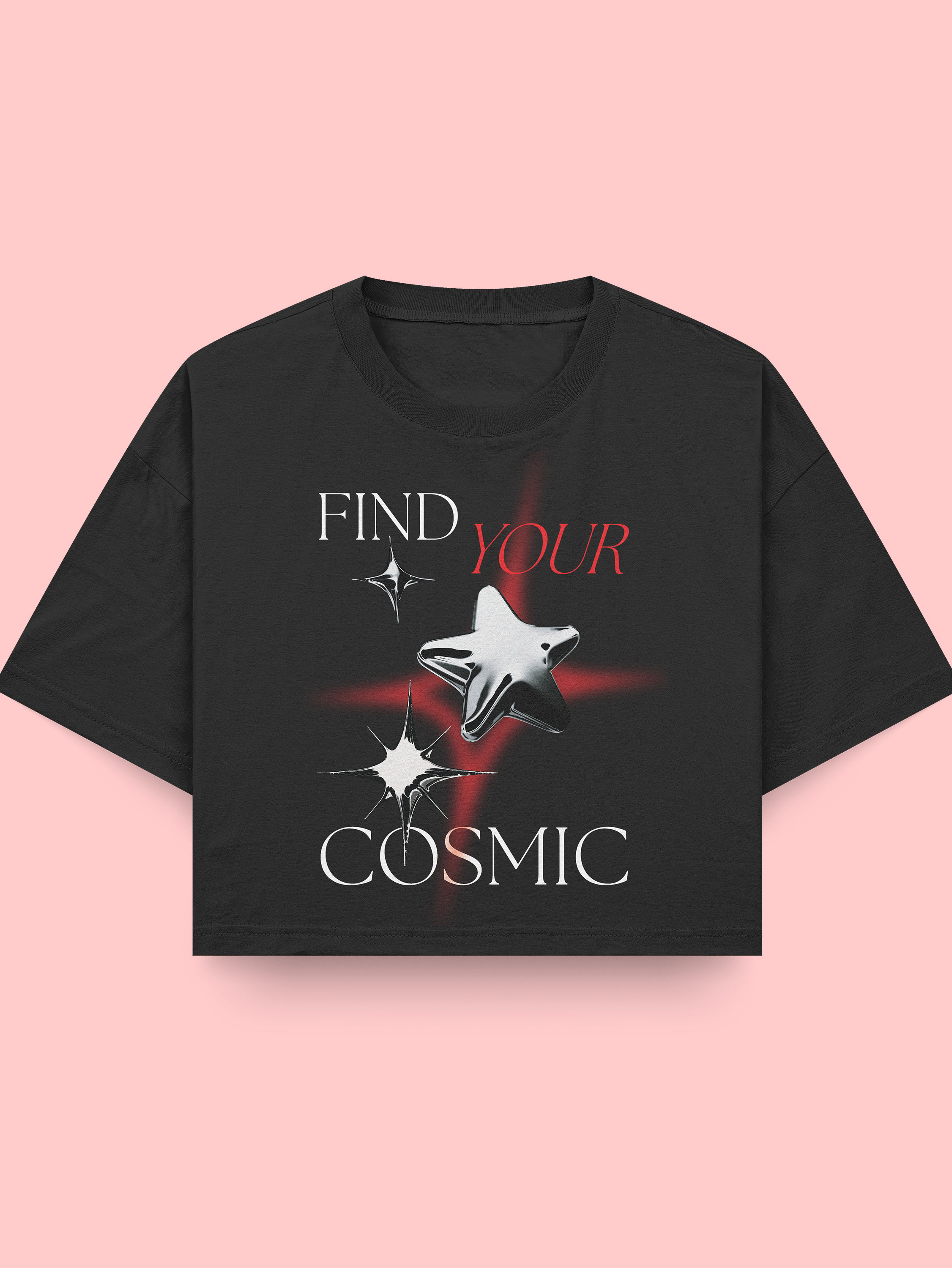
I didn’t want the design to live on a wall forever, so I brought it to life on a jersey tee shirt and cropped tee — same intensity, new context. Whether you wear it or frame it, this one’s for the overachievers who make it look effortless.
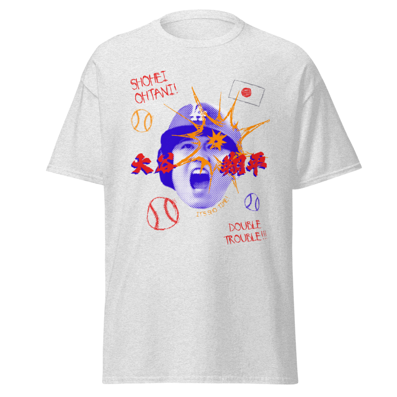
Full shirt design front (RGB)
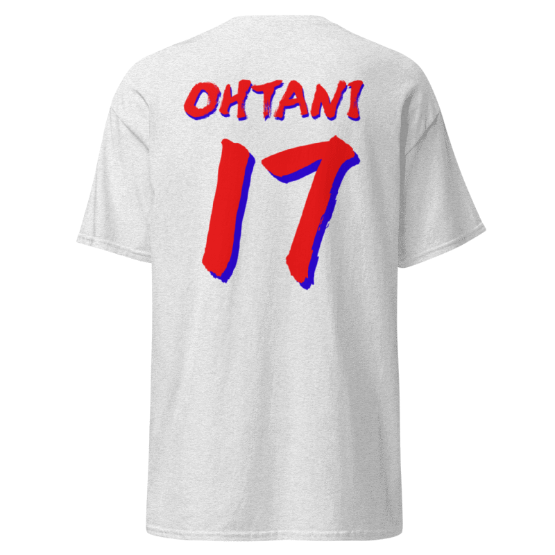
Full shirt design back (RGB)
Close up of shirt details
Me modeling one of the shirts I designed and printed
My entire process summed up in a reel for social media
This poster started as a vision while watching baseball — something I initially didn’t plan to come into fruition. But the energy of it stuck with me. I was drawn to the contrast between clean typography and chaotic brush elements, so I kept pushing it until it felt like a visual shout — intense, fast-paced, and layered like Ohtani’s style on the field.
Design-wise, I focused on merging motion and texture. The custom type pulls from Japanese calligraphy influence while also playing with distortion and scale to emphasize impact. I let the red and blue dominate to reflect power and pressure — it’s not calm, it’s not quiet, and that’s intentional.
The final result felt too good to keep on paper, so I brought it into the fashion space as a crop top and a t-shirt inspired jersey. The design translated cleanly, and wearing it feels like putting on a statement — personal, bold, and a little chaotic in the best way (yes, I actually got this shirt printed!)